Theme America – ecommerce theme

Theme America – ecommerce theme
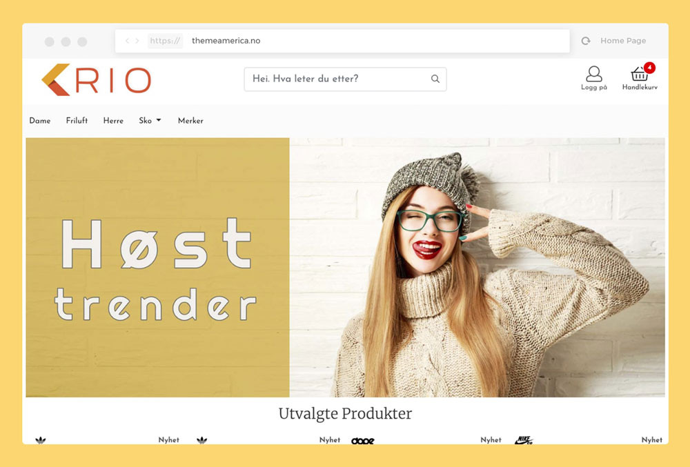
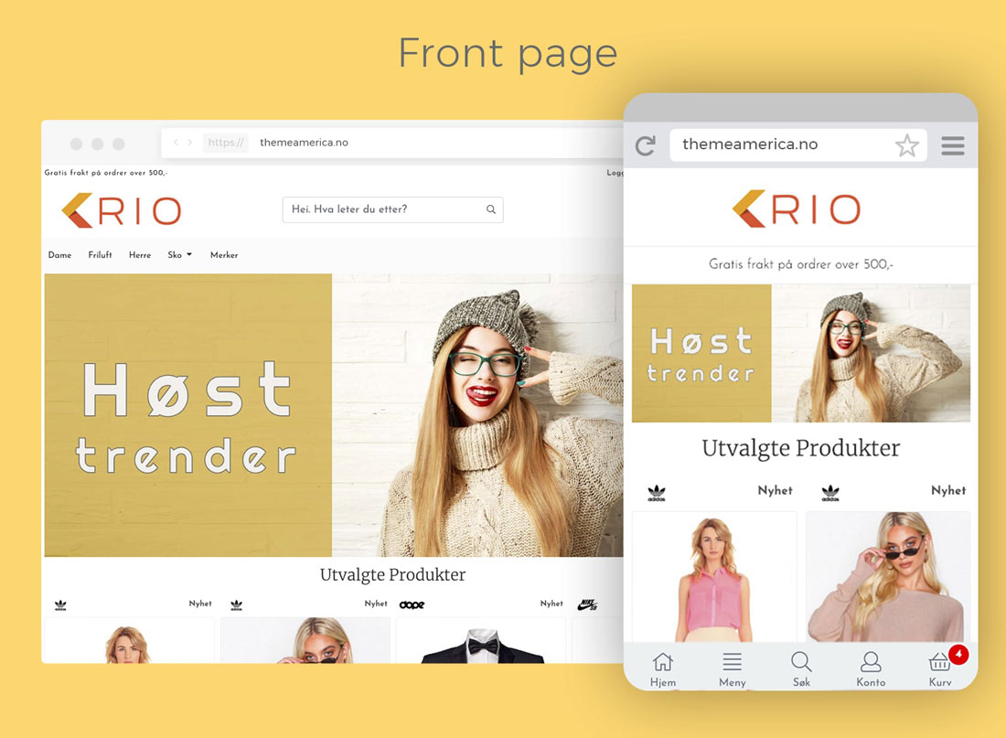
TL;DR: A theme designed in 2018 using all the newest design principles available at the time. This includes a real mobile-first approach where i designed the theme only for mobile and designed and developed «outwards» to tablets and then to desktop in the end. The design was based on the look and feel of native apps with bottom menu, big images and easy/uncluttered interface.
MY ROLE
UX, UI and frontend development
WHY
The why is easy… I wanted to create a new design system for our platform, using the newest design and frontend technology. Starting with a mobile first design, emulating the look and feel of a native app, we could develop a modern theme with alot of functionality and flexibility for our customers.
WHAT
As mentioned in the TL;DR, i designed the UX and UI for mobile only and when this design was developed, i created a larger design for tablets and HD screens as well. When i had set up a local development server, i started coding the frontend stuff from scratch, using Bootstrap 4 and JQuery 3 (the newest versions at the time). When i had the mobile version like the prototype, only prettier, i started developing the wider viewports. After a while, when i was happy with the design and quality of the code, i handed it over to the real developers so they could do the last magic so the design theme could work 100%.
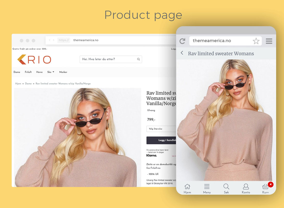
This design includes a lot of new features and functionality for our customers like sidebar, different menus and productpages, depending on their product range and design.
PROTOTYPE
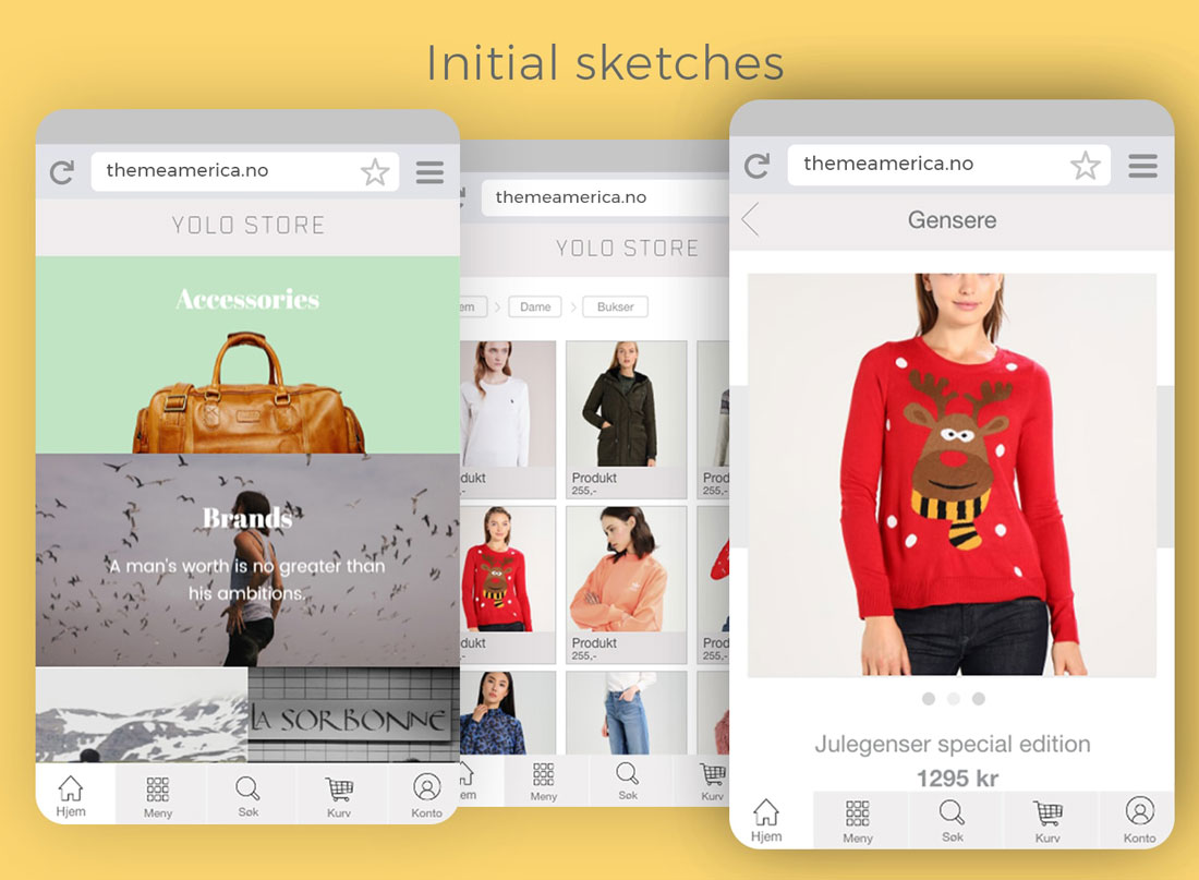
I created an initial prototype in Adobe XD. Seeing as this was one of my first prototypes in XD and the fact that XD was pretty limited at that time, my prototype was also limited 🙃 but it can be tested here anywho:
Live prototype on Adobe XD
The prototype was made up of a front page with bottom menu, a categories page and product page.
STATUS
After the template was in beta, one of our customers wanted to use the template for a new store focused on terrain bikes, electric bikes and extremesport. The idea was to have a physical store where customers could see and test the products and to have a high-end webshop.
I used this theme as a base and created the initial sketches based on interacting with the customer, researching trends in this market and feedback from early tests.
The customer accepted the prototype and i started building the webshop. After quite a while, the entire concept was cancelled. The webshop was then almost finished but i got to use alot of the features and feedback to create a even better «base template» so it was ok.
The prototype can be tested here: Villere prototype on UXPin
I created a new productpage with focus on large HD images, video and detailed product information. In addition, the customer wanted different examples of categories page so i made a few of that as well.
The live, and almost complete version of the store can be viewed and tested here: Villere demo
The «base template» is ready for our customers to buy and use so it will be really cool to see how this works out. It should be fine as some of our biggest customers already have ordered it and are ready to go to America ![]()


